I’m in the middle of recertifying as a SQL Server MCSE, studying for a Mathematics Degree with the Open University and trying to train for various long distance cycling events. It can feel like an uphill struggle to fit it all in and still have time for friends and family (and the cats). And that’s without the usual 9-5 we all have
So how to juggle it all?
I try to think first in long term chunks, usually 6 months and 12 months. For an OU module I have to think across a whole 12 month period as that’s the teaching period. For my MCSE I can split it into 6 month chunks (doing MCSA in the first 6 months, and then the remaining exams in another 6 month period).
Once I’ve made sure that I am not overloading myself in one period I make sure I have all the dates on the calendar.
First off I block out any immovable dates, for example our wedding anniversary, OU exam periods, important birthdays, etc. These are sacrosanct and I either can’t or won’t move them. Everything else has to fit in around these, or will have to be a once in a life time opportunity.
Next to go in are the dates I want to achieve something. This could be an MCSE examination or a particular Audax event. These could be fixed or movable. This year for example:
I have a fixed goal date of the end of July for being fit enough to ride the London Edinburgh London audax. This can’t be moved.
I have an exam date set in August for completing the MCSA phase of my MCSE qualification. This could be moved if needed.
OU assignment hand ins. These are a fixed deadline, but I can hand in earlier if needed if I need to free up time. (Next week I’ll be doing this so I’m not working through a holiday)
Now I’ve got the goals I can start working backwards to work our what needs to happen when. How I do this for each goal will be different depending on how I need to study or work towards them. For my cycling goals I know I’ll need more time and effort as the goal nears as I’ll be taking longer training rides. Studying for my courses and exams should hopefully remain constant with just a slight increase in time as I revise before exams.
Now I’ve a good idea of what I need to do and when I can start to plan my weeks to make sure I’ve got some time set aside to get everything done. So I’ll block out 3 hours on a Wednesday straight after work to go for a long training ride on the bike, with shorter 1 hour rides on a Monday and Friday. Then I might schedule 2 hours on a Thursday after dinner to work on my OU course or even 2 evening for some of the tougher modules.
By having a set routine it gets easier to remember what you’re meant to be doing when, and all the other bits and pieces fall into place. And by sharing the routine with my wife we both know when I’m going to be busy, or days when I’d rather not have something else happen.
But having done all that planning it’s important to stay flexible, stuff happens.
A tier 1 database down at work 10 minutes before clocking off time on a wednesday, you can be sure my bike ride’s gone out the window.
A friend is visiting town for the first time in years on a Thursday evening, not a problem, as I know when my free slots are so I can move my study time around to suit.
All of it’s easily coped with if you’ve left yourself some slack. And remember, it’s always good to have some downtime. A night in from of the TV isn’t wasted if you’re relaxing from hard work on the other nights, especially if you’re relaxing with loved one.
In the last post (Simple plot of perfmon data in R) I covered how to do a simple plot of perfmon counters against time. This post will cover a couple of slightly more advanced ways of plotting the data.
First up is if you want to average your data to take out some of the high points. This could be useful if you’re sampling at 15 second intervals with perfmon but don’t need that level of detail.
The initial setup and load of data is the same as before (if you need the demo csv, you can download it here):
install.packages(c("ggplot2","reshape2"))
library("ggplot2")
library("reshape2")

data <-read.table("C:\\R-perfmon\\R-perfmon.csv",sep=",",header=TRUE)
cname<-c("Time","Avg Disk Queue Length","Avg Disk Read Queue Length","Avg Disk Write Queue Length","Total Processor Time%","System Processes","System Process Queue Length")
colnames(data)<-cname
data$Time<-as.POSIXct(data$Time, format='%m/%d/%Y %H:%M:%S')

avgdata<-aggregate(data,list(segment=cut(data$Time,"15 min")),mean)

avgdata$segment<-as.POSIXct(avgdata$Time, format='%Y-%m-%d %H:%M:%S')
avgdata$Time<-NULL
mavgdata<-melt(avgdata,id.vars="segment")

ggplot(data=mavgdata,aes(x=segment,y=value,colour=variable))+
+ geom_point(size=.2) +
+ stat_smooth() +
+ theme_bw()
The first 8 lines of R code should look familiar as they’re the same used last time to load the Permon data and rename the columns. Once that’s done, then we:
10: Create a new dataframe from our base data using the aggregate function. We tell it to work on the data dataframe, and that we want to segment it by 15 minute intervals, and we want the mean average across that 15 minute section
11: We drop the Time column from our new dataframe, as it’s no longer of any us to us
12: Convert the segment column to a datetime format (note that we use a different format string here to previous calls, this is due to the way that aggregate writes the segment values.
13: We melt the dataframe to make plotting easier.
And then we use the same plotting options as we did before, which gives us:
If you compare it to this chart we plotted before with all the data points, you can see that it is much cleaner, but we’ve lost some information as it’s averaged out some of the peaks and troughs throughout the day:
But we can quickly try another sized segment to help out. In this case we can just run:
In the last part (here) we setup a simple R install so we could look at analysing and plotting perfmon data in R. In this post we’ll look about creating a very simple plot from a perfmon CSV. In later posts I’ll show some examples of how to clean the data up, to pull it from a SQL Server repository, combine datasets for analysis and some of the other interesting things R lets you do.
So lets start off with some perfmon data. Here’s a CSV (R-perfmon) that contains the following counters:
Physical Disk C:\ Average Disk Queue Length
Physical Disk C:\ Average Disk Read Queue Length
Physical Disk C:\ Average Disk Write Queue Length
% Processor Time
Processes
Processor Queue Length
Perfmon was set to capture data every 15 seconds.
Save this to somewhere. For the purposes of the scripts I’m using I’ll assume you’ve put it in the folder c:\R-perfmon.
Fire up your R environment of choice, I’ll be using R Studio. So opening a new instance, and I’m granted by a clean workspace:
On the left hand side I’ve the R console where I’ll be entering the commands and on the right various panes that left me explore the data and graphs I’ve created.
As mentioned before R is a command line language, it’s also cAse Sensitive. So if you get any strange errors while running through this example it’s probably worth checking exactly what you’ve typed. If you do make a mistake you can use the cursor keys to scroll back through commands, and then edit the mistake.
So the first thing we need to do is to install some packages, Packages are a means of extending R’s capabilities. The 2 we’re going to install are ggplot2 which is a graphing library and reshape2 which is a library that allows us to reshape the data (basically a Pivot in SQL Server terms). We do this with the following command:
install.packages(c("ggplot2","reshape2"))
You may be asked to pick a CRAN mirror, select the one closest to you and it’ll be fine. Assuming everything goes fine you should be informed that the packages have been installed, so they’ll now be available the next time you use R. To load them into your current session, you use the commands:
library("ggplot2")
library("reshape2")
So that’s all the basic housekeeping out of the way, now lets load in some Perfmon data. R handles data as vectors, or dataframes. As we have multiple rows and columns of data we’ll be loading it into a dataframe.
data <-read.table("C:\\R-perfmon\\R-perfmon.csv",sep=",",header=TRUE)
IF everything’s worked, you’ll see no response. What we’ve done is to tell R to read the data from our file, telling it we’re using , as the seperator and that the first row contains the column headers. R using the ‘<-‘ as an assignment operator.
To prove that we’ve loaded up some data we can ask R to provide a summary:
summary(data)
    X.PDH.CSV.4.0...GMT.Daylight.Time...60.
 04/15/2013 00:00:19.279:   1
 04/15/2013 00:00:34.279:   1
 04/15/2013 00:00:49.275:   1
 04/15/2013 00:01:04.284:   1
 04/15/2013 00:01:19.279:   1
 04/15/2013 00:01:34.275:   1
 (Other)                :5754
 X..testdb1.PhysicalDisk.0.C...Avg..Disk.Queue.Length
 Min.   :0.000854
 1st Qu.:0.008704
 Median :0.015553
 Mean   :0.037395
 3rd Qu.:0.027358
 Max.   :4.780562

 X..testdb1.PhysicalDisk.0.C...Avg..Disk.Read.Queue.Length
 Min.   :0.000000
 1st Qu.:0.000000
 Median :0.000980
 Mean   :0.017626
 3rd Qu.:0.003049
 Max.   :4.742742

 X..testdb1.PhysicalDisk.0.C...Avg..Disk.Write.Queue.Length
 Min.   :0.0008539
 1st Qu.:0.0076752
 Median :0.0133689
 Mean   :0.0197690
 3rd Qu.:0.0219051
 Max.   :2.7119064

 X..testdb1.Processor._Total....Processor.Time X..testdb1.System.Processes
 Min.   :  0.567                               Min.   : 77.0
 1st Qu.:  7.479                               1st Qu.: 82.0
 Median : 25.589                               Median : 85.0
 Mean   : 25.517                               Mean   : 87.1
 3rd Qu.: 38.420                               3rd Qu.: 92.0
 Max.   :100.000                               Max.   :110.0

 X..testdb1.System.Processor.Queue.Length
 Min.   : 0.0000
 1st Qu.: 0.0000
 Median : 0.0000
 Mean   : 0.6523
 3rd Qu.: 0.0000
 Max.   :58.0000
And there we are, some nice raw data there. Some interesting statistical information given for free as well. Looking at it we can see that our maximum Disk queue lengths aren’t anything to worry about, and even though our Processor peaks at 100% utilisation, we can see that it spends 75% of the day at less the 39% utilisation. And we can see that our Average queue length is nothing to worry about.
But lets get on with the graphing. At the moment R doesn’t know that column 1 contains DateTime information, and the names of the columns are rather less than useful. To fix this we do:
cname<-c("Time","Avg Disk Queue Length","Avg Disk Read Queue Length","Avg Disk Write Queue Length","Total Processor Time%","System Processes","System Process Queue Length")
colnames(data)<-cname
data$Time<-as.POSIXct(data$Time, format='%m/%d/%Y %H:%M:%S')
mdata<-melt(data=data,id.vars="Time")
First we build up an R vector of the column names we’d rather use, “c” is the constructor to let R know that the data that follows is to interpreted as vector. Then we pass this vector as an input to the colnames function that renames our dataframe’s columns for us.
On line 3 we convert the Time column to a datetime format using the POSIXct function and passing in a formatting string.
Line 4, we melt our data. Basically we’re turning our data from this:
Time
Variable A
Variable B
Variable C
19/04/2013 14:55:15
A1
B2
C9
19/04/2013 14:55:30
A2
B2
C8
19/04/2013 14:55:45
A3
B2
C7
to this:
ID
Variable
Value
19/04/2013 14:55:15
Variable A
A1
19/04/2013 14:55:30
Variable A
A2
19/04/2013 14:55:45
Variable A
A3
19/04/2013 14:55:15
Variable B
B2
19/04/2013 14:55:30
Variable B
B2
19/04/2013 14:55:45
Variable B
B2
19/04/2013 14:55:15
Variable C
C9
19/04/2013 14:55:30
Variable C
C8
19/04/2013 14:55:45
Variable C
C7
This allows to very quickly plot all the variables and their values against time without having to specify each series
This snippet introduces a new R technique. By putting + at the end of the line you let R know that the command is spilling over to another line. Which makes complex commands like this easier to read and edit. Breaking it down line by line:
tells R that we want to use ggplot to draw a graph. The data parameter tells ggplot which dataframe we want to plot. aes lets us pass in aesthetic information, in this case we tell it that we want Time along the x axis, the value of the variable on the y access, and to group/colour the values by variable
tells ggplot how large we’d like the data points on the graph.
This tells we want ggplot to draw a best fit curve through the data points.
Telling ggplot which theme we’d like it to use. This is a simple black and white theme.
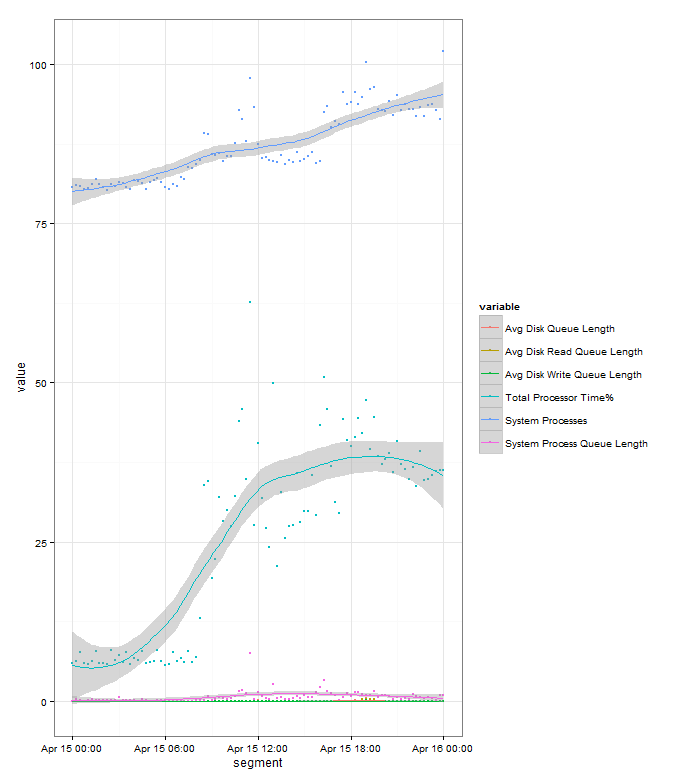
Run this and you’ll get:
The “banding” in the data points for the System processes count is due to the few discrete values that the variable takes.
The grey banding around the fitted line is a 95% confidence interval. The wider it is the greater variance of values there are at that point, but in this example it’s fairly tight to the plot so you can assume that it’s a good fit to the data.
We can see from the plot that the Server is ticking over first thing in the morning then we see an increases in load as people start getting into the office from 07:00 onwards. Appears to be a drop off over lunch as users head away from their clients, and then picks up through the afternoon. Load stays high through the rest of the day, and in this example it ends higher than it started as there’s an overnight import running that evening, though if you hadn’t know that this plot would have probably raised questions and you’d have investigate. Looking at the graph it appears that all the load indicators (Processor time% and System Processes) follow each other nicely, later in this series we’ll look at analysing which one actually leads the other
You can also plot the graph without all the data points for a cleaner look:
Perfmon is a great tool for getting lots of performance information about Microsoft products. But once you’ve got it it’s not always the easiest to work with, or present to management. As a techy you want to be able to use the data to compare systems across time, or even to cross corellate performance between seperate systems.
And management want graphs. Well, we all want graphs. For many of my large systems I now know the shape of graph that plotting CPU against time should give me, or the amount of through put per hour, and it only takes me a few seconds to spot when something isn’t right rather than poring through reams of data.
There are a number of ways of doing this, but my preferred method is to use a tool called R. R is a free programming language aimed at Statistical analysis, this means it’s pefectly suited to working with the sort of data that comes out of perfmon, and it’s power means that when you want to create baselines or compare days it’s very useful. It’s also very easy to write simple scripts in R, so all the work can be done automatically each night.
It’s also one of the tools of choice for statistical analysis in the Big Data game, so getting familiar with it is a handy CV point for SQL Server DBAs.
Setting R up is fairly straight forward, but I though I’d cover it here just so the next parts of this series follow on.
The main R application is available from the CRAN (Comprehensive R Archive Network) repository – http://cran.r-project.org/mirrors.html From there, pick a local mirror, Click the Download for Windows link, select the “base” subdirectory, and then “Download R 3.0.0 for Windows” (version is correct at time of writing 18/04/2013).
You now have an installer, double click on it and accept all the defaults. If you’re running a 64-bit OS then it will by default install both the 32-bit and 64-bit versions. You’ll now have a R folder on your Start Menu, and if you select the you’ll end up at the R console:
R is a command line language out of the box. You can do everything from within the console, but it’s not always the nicest place. So the next piece of software to obtain and install is RStudio, which can be downloaded from here, and installed using the defaults. This is a nicer place to work:
You should now have a working R setup. In the next part we’ll load up some perfmon data and do some work with it.
OK, so I thought it might be handy for SQLBits 2013 attendees to have some guidance to the better pubs in Nottingham and Beeston.
My idea of a better pub is a good wide range of well kept beer, plenty of room, friendly knowledgable staff, food available and somewhere I wouldn’t mind spending a night sitting chatting even if I wasn’t drinking their beer
If you’re staying at the East Midlands Conference Center, then you are on the Beeston side of town. There’s some very good pubs that side, but they are about a 30 minute walk from the conference centre or a 10 minute taxi ride (probably about £6 each way). If you do want to venture out, then the best 2 are:
Right behind Beeston train station. Great pub with a wide range of ales, ciders and whiskeys. Also has very good food. Can get quite busy, though has a large covered outside area with heating.
Smallish pub in the Lace Market area, by St Mary’s church. Can get very busy at office closing time, but thins out once they’ve had a pint. Good range of ales on, and a lot of bottles as well. Plenty of European lagers. Good food as well.
Little bit out of town up Mansfield Road, but worth the trip (the Golden Fleece on the way up can be worth stopping for one if you need a breather). Another former CAMRA pub of the year winner (we seem to have quite a few in Nottingham). Always well kept beers, and a huge whisky selection. Another pub with a very good food menu. And it is holding a mini beer festival the weekend of SQLBits so there’ll be even more choice than usual.
Built into what remain of the old Nottingham City Centre hospital. Unusual in that I’ve never been in a completely circular pub anywhere else. Good range of beers, good tasting platters (3x 1/3 pints plus bar snacks). Food OK, but standard pub options done well rather than anything exciting
A little wander up Derby Road past the cathedral, but worth it for a pub built back into the caves of Nottingham. Always well kept beers with a good range of guests. Restaurant style eating available.
Nottingham CAMRA keeps a good list of other pubs as well. And while SQLBits is on, they’ll be hosting their annual Mild in May event, where a larger number of pubs will be making sure to carry some of the finer examples of this beer type
If you want any other recommendation, or something close to a particular hotel, just drop me a line and I’m sure I can come up with something for you.
This is the story of how I cam to love presenting, how we went through a rocky patch, but patched it up in the end.
Years ago I was getting swamped by work. Everywhere I looked there seemed to be another call coming in, another request for something to be done, another bit of housekeeping that was begging to get done, all of it landing on me and swamping me. End result,an unhappy DBA who didn’t feel as though he was developing any new skills or progressing his career.
Then I realised, hang on I’m part of a team, why aren’t we sharing? So at a rare team meeting I asked around, and it turned out we all felt the same. While we all wrote our mandated documentation, no one really felt they could delve into some else’s domain. So we decided the best way was to do presentations across the team, cross training each other into our areas.
This was a revelation. Suddenly people were interested in helping out, documentation didn’t seem quite so much of a chore as there was a real point to it. Team meetings changed from a dull routine to satisfy management into something to look forward to as a chance to learn something new. Everyone in the team learnt some new skills, and we became a much more efficient and cohesive team. And because we were efficient we had more time to learn new things for ourselves, so everyone was a winner. And I discovered I loved presenting. Seeing the light break as someone grasped a new concept, having to approach things from a different angle, having to break down concepts to there simplest levels to make sure I understood them; all of this was great
But soon the shine wore off a bit. We’d passed on all the work related information, and the excitement of presenting had warn off a bit as I knew my audience to well. With every presentation I knew the level to target, and even the best way to address a topic to specific team members. So me and my presenting stumbled around in the doldrums for a bit. I’d occasionally get excited when I learnt something new to me, but the thrill just wasn’t there anymore…..
I’d been attending SQL User groups for a year or so, and loved seeing some of the top SQL Server gurus from around the world presenting to small groups and having to deal with such a wide range of audience knowledge and engagement. I mean, only a short slot to present something technical, to a group you’ve never met, when you’ve no idea if there’s going to be an expert in the crowd ready to pick you up on something, where there could be a large section who have no interest in your topic but you still need to win them over, this looked like just my sort of gig.
I’ve now presented at 2 SQL Server user groups. And each time I got that same feeling from years ago. The flame is back, and I’m constantly thinking about how to improve my presentations, or how I can build one out of things I’m currently working on. I’m also paying more attention to speakers presenting skills than I did before, trying to work out if there’s anything I could ‘borrow’ to improve my skills. And I dig deeper into topics, because I want to be able to explain each oddity, or be ready for the off kilter question from the audience.
In fact most of my training for the coming year is based around becoming a better presenter and teacher. I want to do more User group presentations, have submitted to a couple of SQL Saturday events, and want to try to do some of the larger conferences next year. I’m also working on an MCT, and am even considering taking some speaking classes
So go on, get up on the stage. Presenting, whether to colleagues or a User Group could be just what you need to perk up your career or rekindle your passion for your job.
Up to a certain size and for quick sampling using perfmon data in a CSV file makes life easy. Easily pulled into Excel, dumped into a pivot table and then analysed and distributed.
But once they get up to a decent size, or you’re working with multiple files or you want to correlate multiple logs from different servers, then it makes sense to migrate them into SQL Server. Windows comes with a handy utility to do this, relog, which can be used to convert perfmon output to other formats. Including SQL Server.
First off you’ll need to set up an ODBC DSN on the machine you’re running the import from. Nothing strange here, but you need to make sure you use the standard SQL Server driver.
If you use the SQL Server Native Client you’re liable to run into this uninformative error:
0.00%Error: A SQL failure occurred. Check the application event log for any errors.
and this also unhelpful 3402 error in the Application Event log:
Once you’ve got that setup it’s just the syntax of the relog command to get through. The documentation says you need to use:
-o { output file | DSN!counter_log }
What it doesn’t say is that counter_log is the name of the database you want to record the data into. So assuming you want to migrate your CSV file, c:\perfmon\log.csv, into the database perfmon_data using the DSN perfmon_obdbc, you’d want to use:
While picking up new technical skills is the main reason for attending SQL Server events like User Groups and SQL Saturdays, there’s also another very good reason for attending. Watching some of the presenters just present is of great value.
All the speakers are obviously technically very good, but what really separates them from the other technical people present is their presentation styles. There’s a wide range on display, from the ultra focused business style talking about career enhancement to the enthusiastic geek motivator who’s all about getting you fired up about the newest tech.
But even with the difference overall feel, there’s still some common points that I aim to always incorporate into my presentations:
Be prepared. They make it look pretty effortless as they turn up and go. But that’s down to have rehearsed and practiced the material, and knowing they have a backup should anything go wrong
Engage with the audience. There isn’t a feeling of “you’ll sit there and watch and listen for the next 45 minutes”. They try to get the audience to interact with the material and think about how it would work for them
Time Management. They have the time built in to answer questions on the fly, but also know where they are in the presentation so they can politely say ‘talk later’ if they’re running behind. And from watching them do the same presentation to multiple audiences they also know how to extend it if noone’s asking questions.
Clear, easy to read materials. Slides aren’t cluttered with logos or fancy backgrounds. And occasionally handouts for frequently referenced info, this is a great idea, and makes it easy to take something away at the end.
So that’s just 4 quick and easy things to incorporate into your own presenting then! But in my opinion they all tie together, and the main thing you can do to bring them out is PRACTICE.
I’m sure my cats know more about SQL Server then any other cats on the planet, but they do insist on sitting there watching me present to no one with slides on the wall of the home office. Luckily my wife will also put up with me doing it, and in fact will often be a source of good feedback. As a non technical person, if she feels she’s sort of following the plot I’ve got the level right.
And it’s very rare that I’ll give the same presentation twice. Each time I present something I try to get feedback (and really appreciate it being given) and then use that to feed back for the next presentation.
Like a lot of other people I wasn’t best pleased to see the announcement on Thursday that Google were killing off Google Reader. I’ve got it set up just right for quickly sorting through all the blogs I follow to find the stuff I’m interested in.
I follow a lot of different blogs on a number of different subject, so there’s often a couple of hundred posts to get through, which I can currently do pretty quickly. So to be a credible replacement for Google Read I’m looking for a service/app that does the following:
Keyboard shortcuts. This has to be there, and there should be a shortcut for every major operation. This is one of the greatest time savers I’ve found with Reader. I can quickly ‘n’ my way through entire folders, ‘s’ing the ones I want to read when I’ve got time and ‘e’ing others to people who’d appreciate them
Should be open to any client. Over the years I’ve tried various mobile clients to reader to get the best one. So I don’t want to be lumbered with a single client option
Clean simple interface. I really don’t want anything that tries to look like a newspaper or insists on silly transitions between articles. If you want to offer that, great, but let me turn it off and just have a plain view
Integration with IFTTT – OK this may be more down to IFTTT picking who it’s supporting. But I use this a lot. I take articles and then let IFTTT do the sharing to various streams for me. Quick and simples.
Folders, really this is basic stuff, but some of the suggested apps I’ve seen don’t have them
Don’t push the ‘Social’ aspects too hard. I just want the feeds aggregating. Not interested in what’s hot or what others are reading. If it’s genuinely good on the subject it’ll filter through the normal channels
No ads. I’m happy to fork out a few sheckles a month to keep a service running, and if I do then keep the ads out of the way. Or if you want to use me as the product (like Google do/did) then that’s fine, but no injecting junk into my feeds.
Easy subscription mechanism. Getting new feeds into Reader was nice and simple, so let’s have that carried on
So that’s the wants. Does anything meet that at the moment? Well feedly seems OK, but falls down on an overly fussy UI, not enough keyboard shortcuts, you have to use their mobile client and there’s no IFTTT support (yet).
I’ve had a look at fever which seems to offer lots of features. You have to host it yourself, but with a couple of domains to choose from that’s not a problem. Doesn’t do everything, but having source code means I could probably tinker in the bits I want.
Reader’s not disappearing till June, so hopefully in the next 3 months we’ll see some of the existing products upping their game, and some new players appearing. So for the meantime I’m going to carry on as I was, but keeping an eye out for the next ones to follow.
Taking notes when learning something new is a pretty key part of how I learn. It helps me concentrate on the key points, and gives me some quick things to jog memory when reviewing the information later.
I’ve always been a notebook and pen type of guy for this. I have reams of A4 paper covered in scrawls, all of which is ‘filed’ away. Well, I say filed, there’s a couple of large folders roughly labelled “SQL”, “Maths”, “Everything Else”. So of course once I’d read it, it could take a while to find it when I needed it again.
Having become a convert to Evernote I started copying some of the notes over into it so I’d have them to hand wherever I was. I used a mixture of typing them up, and photographing them with my iPhone. Both worked pretty well, with the main limiting factor being my rushed handwriting.
So I decided that the next conference I was going to I’d try to take notes straight into Evernote, and skip the paper step. The next conference happened to be SQL Saturday 194 in Exeter. So armed with my trusty Nexus 7 I decided to give it a go.
I stuck with typing notes. I found that I could just about keep up with a combination of thumb typing, some swypeing and using plenty of abbreviations. I realised just how much I haven’t ‘programmed’ the internal dictionary for technical terms, so I’ll be making sure to type plenty of keywords till it’s learnt some of the basics. The next event I attend I’ll also give drawing/jotting notes a try, that could be quicker, but may lead to the same handwriting issues as the paper version.
I also found that the tablet itself sometimes made me feel a bit self-concious about taking notes on it. I think this is due to it being something new to me, so I was concious of having to concentrate on using it. Whereas paper and pen I don’t even think about when I’m jotting stuff down.
I still had to do some tidying up of the notes, but could usually do that quickly in the breaks, or while settling down for the next speaker. And after the event I found it handy that I could quickly annotate the notes with Twitter handles and blog links, so when I do refer to the notes I’ve got all that to hand as well.
So overall it was a success, but it’s definitely going to be a process to get this right.