
In the last post (Simple plot of perfmon data in R) I covered how to do a simple plot of perfmon counters against time. This post will cover a couple of slightly more advanced ways of plotting the data.
First up is if you want to average your data to take out some of the high points. This could be useful if you’re sampling at 15 second intervals with perfmon but don’t need that level of detail.
The initial setup and load of data is the same as before (if you need the demo csv, you can download it here):
install.packages(c("ggplot2","reshape2"))
library("ggplot2")
library("reshape2")

data <-read.table("C:\\R-perfmon\\R-perfmon.csv",sep=",",header=TRUE)
cname<-c("Time","Avg Disk Queue Length","Avg Disk Read Queue Length","Avg Disk Write Queue Length","Total Processor Time%","System Processes","System Process Queue Length")
colnames(data)<-cname
data$Time<-as.POSIXct(data$Time, format='%m/%d/%Y %H:%M:%S')

avgdata<-aggregate(data,list(segment=cut(data$Time,"15 min")),mean)

avgdata$segment<-as.POSIXct(avgdata$Time, format='%Y-%m-%d %H:%M:%S')
avgdata$Time<-NULL
mavgdata<-melt(avgdata,id.vars="segment")

ggplot(data=mavgdata,aes(x=segment,y=value,colour=variable))+
+ geom_point(size=.2) +
+ stat_smooth() +
+ theme_bw()
The first 8 lines of R code should look familiar as they’re the same used last time to load the Permon data and rename the columns. Once that’s done, then we:
10: Create a new dataframe from our base data using the aggregate function. We tell it to work on the data dataframe, and that we want to segment it by 15 minute intervals, and we want the mean average across that 15 minute section
11: We drop the Time column from our new dataframe, as it’s no longer of any us to us
12: Convert the segment column to a datetime format (note that we use a different format string here to previous calls, this is due to the way that aggregate writes the segment values.
13: We melt the dataframe to make plotting easier.
And then we use the same plotting options as we did before, which gives us:
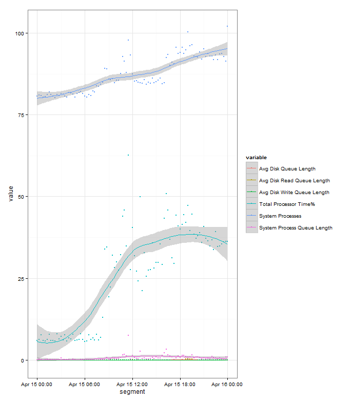
If you compare it to this chart we plotted before with all the data points, you can see that it is much cleaner, but we’ve lost some information as it’s averaged out some of the peaks and troughs throughout the day:

But we can quickly try another sized segment to help out. In this case we can just run:
minavgdata<-aggregate(data,list(segment=cut(data$Time,"15 min")),mean)
minavgdata$Time<-NULL
minavgdata$segment<-as.POSIXct(minavgdata$Time, format='%Y-%m-%d %H:%M:%S')
mminavgdata<-melt(minavgdata,id.vars="segment")

ggplot(data=mminavgdata,aes(x=segment,y=value,colour=variable))+
+ geom_point(size=.2) +
+ stat_smooth() +
+ theme_bw()
Which provides us with a clearer plot that our original, but keeps much more of the information than the 15 minute average:


Michael
Hi Stuart,
thanks for sharing the R-Code. There is a little mistake: first fill avgdata$segment and then empty avgdata$Time (line 11 & 12).
Stuart Moore
Aha, thanks for pointing that out.
Durai Srinivasan
Hi Stuart,
Thanks for Sharing this. When I searching how to analyse perfmon counters using R and got your post.
Stuart Moore
Hi,
Glad you found it useful. Let me know if you have any more questions.
Cheers
Stuart
guy-roger tilkin
Hello,
Many thanks you are probably one of the first to use R for counters and write something about that. The idea occured to me many times and I stumbled on your post.
GuyR
Stuart Moore
Happy to hear it’s useful Guy. Let me know if there’s anything else you’d like on the topic
Cheers
Stuart