You’ve had a disaster at work, the data centre is off line, management are panicing and money is being lost. What should you be doing?
Short answer :
nothing that isn’t in the Disaster Recovery plan (you do have one of those don’t you?)
Longer answer:
Some time ago I got into work at my usual hour to notice a distinct lack of server admins at their desks and other early starters unable to log in to Active Directory, neither of which filled me with confidence for a quiet day working on writing some training material.
A quick walk down to the data centre found some worried looking electricians, some annoyed looking server admins and a distinct lack of server noise. Obviously something major had failed and taken out everything, so time to dig out the disaster recovery plans..
In previous roles I’ve had responsibility for hardware and infrastructure so the urge to jump in and help out was strong. But I could see that the correct guys were on the case, and that with the influx of panicing management another body was only going to slow things down and get in the way.
So I went back to my desk, got out a copy of the SQL Server Disaster Recovery plan and started refreshing (you do have an offline copy you can read without power, network or server infrastructure?) . This was the best place for me to be, and the best use of my time while things were being fixed, I was ensuring that:
I could be found easily by anyone needing me
Would have information to hand as soon as needed. (which order to bring back the hardware back online, SAN dependencies, etc)
I could make a condensed checklist for what to do when things came back up based on time (ie; kill off an import that would fail due to a missing dependancy)
Keep out of the way of the people who were working hard to get their part of the disaster plan enacted. They really don’t need another person who doesn’t know what’s going on bugging them.
Work with management to work out the order for bringing back services
Make sure I had all the contact details I needed for the service owners who I’d have to liase with for final release (you just know that a disaster will happen while X is on leave, and you won’t have the number for Y who’s covering their role)
All of this meant that when the call came up that the physical layers were back up and running I quickly started bring up the SQL Server instances in an orderly fashion, and could quickly run through my checks before handing them over to the business users for clearance.
Disaster recovery plans take a long time to write and to get right, but if you’ve got it right then on the day it makes life go easier if you stick to it. When the business is suffering it’s not the right time to be improvising, or trying to work on something you’re not completely OK with, or the time to be trying out some new technique you’ve read on a random DBA’s blog.
Making sure you study it is even more important if it’s a disaster plan you didn’t write. If you ever get brought in to enact a disaster recovery plan you’ve never seen before and you don’t know the providence of, make sure you read it thoroughly before you start. You don’t want to get half way through and find out that you’re missing either a vital piece of infrastructure or software.
In the last post (Simple plot of perfmon data in R) I covered how to do a simple plot of perfmon counters against time. This post will cover a couple of slightly more advanced ways of plotting the data.
First up is if you want to average your data to take out some of the high points. This could be useful if you’re sampling at 15 second intervals with perfmon but don’t need that level of detail.
The initial setup and load of data is the same as before (if you need the demo csv, you can download it here):
install.packages(c("ggplot2","reshape2"))
library("ggplot2")
library("reshape2")
data <-read.table("C:\\R-perfmon\\R-perfmon.csv",sep=",",header=TRUE)
cname<-c("Time","Avg Disk Queue Length","Avg Disk Read Queue Length","Avg Disk Write Queue Length","Total Processor Time%","System Processes","System Process Queue Length")
colnames(data)<-cname
data$Time<-as.POSIXct(data$Time, format='%m/%d/%Y %H:%M:%S')
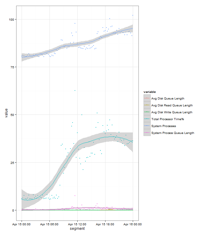
avgdata<-aggregate(data,list(segment=cut(data$Time,"15 min")),mean)
avgdata$segment<-as.POSIXct(avgdata$Time, format='%Y-%m-%d %H:%M:%S')
avgdata$Time<-NULL
mavgdata<-melt(avgdata,id.vars="segment")
ggplot(data=mavgdata,aes(x=segment,y=value,colour=variable))+
+ geom_point(size=.2) +
+ stat_smooth() +
+ theme_bw()
The first 8 lines of R code should look familiar as they’re the same used last time to load the Permon data and rename the columns. Once that’s done, then we:
10: Create a new dataframe from our base data using the aggregate function. We tell it to work on the data dataframe, and that we want to segment it by 15 minute intervals, and we want the mean average across that 15 minute section
11: We drop the Time column from our new dataframe, as it’s no longer of any us to us
12: Convert the segment column to a datetime format (note that we use a different format string here to previous calls, this is due to the way that aggregate writes the segment values.
13: We melt the dataframe to make plotting easier.
And then we use the same plotting options as we did before, which gives us:
If you compare it to this chart we plotted before with all the data points, you can see that it is much cleaner, but we’ve lost some information as it’s averaged out some of the peaks and troughs throughout the day:
But we can quickly try another sized segment to help out. In this case we can just run:
In the last part (here) we setup a simple R install so we could look at analysing and plotting perfmon data in R. In this post we’ll look about creating a very simple plot from a perfmon CSV. In later posts I’ll show some examples of how to clean the data up, to pull it from a SQL Server repository, combine datasets for analysis and some of the other interesting things R lets you do.
So lets start off with some perfmon data. Here’s a CSV (R-perfmon) that contains the following counters:
Physical Disk C:\ Average Disk Queue Length
Physical Disk C:\ Average Disk Read Queue Length
Physical Disk C:\ Average Disk Write Queue Length
% Processor Time
Processes
Processor Queue Length
Perfmon was set to capture data every 15 seconds.
Save this to somewhere. For the purposes of the scripts I’m using I’ll assume you’ve put it in the folder c:\R-perfmon.
Fire up your R environment of choice, I’ll be using R Studio. So opening a new instance, and I’m granted by a clean workspace:
On the left hand side I’ve the R console where I’ll be entering the commands and on the right various panes that left me explore the data and graphs I’ve created.
As mentioned before R is a command line language, it’s also cAse Sensitive. So if you get any strange errors while running through this example it’s probably worth checking exactly what you’ve typed. If you do make a mistake you can use the cursor keys to scroll back through commands, and then edit the mistake.
So the first thing we need to do is to install some packages, Packages are a means of extending R’s capabilities. The 2 we’re going to install are ggplot2 which is a graphing library and reshape2 which is a library that allows us to reshape the data (basically a Pivot in SQL Server terms). We do this with the following command:
install.packages(c("ggplot2","reshape2"))
You may be asked to pick a CRAN mirror, select the one closest to you and it’ll be fine. Assuming everything goes fine you should be informed that the packages have been installed, so they’ll now be available the next time you use R. To load them into your current session, you use the commands:
library("ggplot2")
library("reshape2")
So that’s all the basic housekeeping out of the way, now lets load in some Perfmon data. R handles data as vectors, or dataframes. As we have multiple rows and columns of data we’ll be loading it into a dataframe.
data <-read.table("C:\\R-perfmon\\R-perfmon.csv",sep=",",header=TRUE)
IF everything’s worked, you’ll see no response. What we’ve done is to tell R to read the data from our file, telling it we’re using , as the seperator and that the first row contains the column headers. R using the ‘<-‘ as an assignment operator.
To prove that we’ve loaded up some data we can ask R to provide a summary:
summary(data)
    X.PDH.CSV.4.0...GMT.Daylight.Time...60.
 04/15/2013 00:00:19.279:   1
 04/15/2013 00:00:34.279:   1
 04/15/2013 00:00:49.275:   1
 04/15/2013 00:01:04.284:   1
 04/15/2013 00:01:19.279:   1
 04/15/2013 00:01:34.275:   1
 (Other)                :5754
 X..testdb1.PhysicalDisk.0.C...Avg..Disk.Queue.Length
 Min.   :0.000854
 1st Qu.:0.008704
 Median :0.015553
 Mean   :0.037395
 3rd Qu.:0.027358
 Max.   :4.780562

 X..testdb1.PhysicalDisk.0.C...Avg..Disk.Read.Queue.Length
 Min.   :0.000000
 1st Qu.:0.000000
 Median :0.000980
 Mean   :0.017626
 3rd Qu.:0.003049
 Max.   :4.742742

 X..testdb1.PhysicalDisk.0.C...Avg..Disk.Write.Queue.Length
 Min.   :0.0008539
 1st Qu.:0.0076752
 Median :0.0133689
 Mean   :0.0197690
 3rd Qu.:0.0219051
 Max.   :2.7119064

 X..testdb1.Processor._Total....Processor.Time X..testdb1.System.Processes
 Min.   :  0.567                               Min.   : 77.0
 1st Qu.:  7.479                               1st Qu.: 82.0
 Median : 25.589                               Median : 85.0
 Mean   : 25.517                               Mean   : 87.1
 3rd Qu.: 38.420                               3rd Qu.: 92.0
 Max.   :100.000                               Max.   :110.0

 X..testdb1.System.Processor.Queue.Length
 Min.   : 0.0000
 1st Qu.: 0.0000
 Median : 0.0000
 Mean   : 0.6523
 3rd Qu.: 0.0000
 Max.   :58.0000
And there we are, some nice raw data there. Some interesting statistical information given for free as well. Looking at it we can see that our maximum Disk queue lengths aren’t anything to worry about, and even though our Processor peaks at 100% utilisation, we can see that it spends 75% of the day at less the 39% utilisation. And we can see that our Average queue length is nothing to worry about.
But lets get on with the graphing. At the moment R doesn’t know that column 1 contains DateTime information, and the names of the columns are rather less than useful. To fix this we do:
cname<-c("Time","Avg Disk Queue Length","Avg Disk Read Queue Length","Avg Disk Write Queue Length","Total Processor Time%","System Processes","System Process Queue Length")
colnames(data)<-cname
data$Time<-as.POSIXct(data$Time, format='%m/%d/%Y %H:%M:%S')
mdata<-melt(data=data,id.vars="Time")
First we build up an R vector of the column names we’d rather use, “c” is the constructor to let R know that the data that follows is to interpreted as vector. Then we pass this vector as an input to the colnames function that renames our dataframe’s columns for us.
On line 3 we convert the Time column to a datetime format using the POSIXct function and passing in a formatting string.
Line 4, we melt our data. Basically we’re turning our data from this:
Time
Variable A
Variable B
Variable C
19/04/2013 14:55:15
A1
B2
C9
19/04/2013 14:55:30
A2
B2
C8
19/04/2013 14:55:45
A3
B2
C7
to this:
ID
Variable
Value
19/04/2013 14:55:15
Variable A
A1
19/04/2013 14:55:30
Variable A
A2
19/04/2013 14:55:45
Variable A
A3
19/04/2013 14:55:15
Variable B
B2
19/04/2013 14:55:30
Variable B
B2
19/04/2013 14:55:45
Variable B
B2
19/04/2013 14:55:15
Variable C
C9
19/04/2013 14:55:30
Variable C
C8
19/04/2013 14:55:45
Variable C
C7
This allows to very quickly plot all the variables and their values against time without having to specify each series
This snippet introduces a new R technique. By putting + at the end of the line you let R know that the command is spilling over to another line. Which makes complex commands like this easier to read and edit. Breaking it down line by line:
tells R that we want to use ggplot to draw a graph. The data parameter tells ggplot which dataframe we want to plot. aes lets us pass in aesthetic information, in this case we tell it that we want Time along the x axis, the value of the variable on the y access, and to group/colour the values by variable
tells ggplot how large we’d like the data points on the graph.
This tells we want ggplot to draw a best fit curve through the data points.
Telling ggplot which theme we’d like it to use. This is a simple black and white theme.
Run this and you’ll get:
The “banding” in the data points for the System processes count is due to the few discrete values that the variable takes.
The grey banding around the fitted line is a 95% confidence interval. The wider it is the greater variance of values there are at that point, but in this example it’s fairly tight to the plot so you can assume that it’s a good fit to the data.
We can see from the plot that the Server is ticking over first thing in the morning then we see an increases in load as people start getting into the office from 07:00 onwards. Appears to be a drop off over lunch as users head away from their clients, and then picks up through the afternoon. Load stays high through the rest of the day, and in this example it ends higher than it started as there’s an overnight import running that evening, though if you hadn’t know that this plot would have probably raised questions and you’d have investigate. Looking at the graph it appears that all the load indicators (Processor time% and System Processes) follow each other nicely, later in this series we’ll look at analysing which one actually leads the other
You can also plot the graph without all the data points for a cleaner look:
Up to a certain size and for quick sampling using perfmon data in a CSV file makes life easy. Easily pulled into Excel, dumped into a pivot table and then analysed and distributed.
But once they get up to a decent size, or you’re working with multiple files or you want to correlate multiple logs from different servers, then it makes sense to migrate them into SQL Server. Windows comes with a handy utility to do this, relog, which can be used to convert perfmon output to other formats. Including SQL Server.
First off you’ll need to set up an ODBC DSN on the machine you’re running the import from. Nothing strange here, but you need to make sure you use the standard SQL Server driver.
If you use the SQL Server Native Client you’re liable to run into this uninformative error:
0.00%Error: A SQL failure occurred. Check the application event log for any errors.
and this also unhelpful 3402 error in the Application Event log:
Once you’ve got that setup it’s just the syntax of the relog command to get through. The documentation says you need to use:
-o { output file | DSN!counter_log }
What it doesn’t say is that counter_log is the name of the database you want to record the data into. So assuming you want to migrate your CSV file, c:\perfmon\log.csv, into the database perfmon_data using the DSN perfmon_obdbc, you’d want to use:

 You’ve had a disaster at work, the data centre is off line, management are panicing and money is being lost. What should you be doing?